Creative Journal
Blog post 1 - Behind the scenes of my creative projects
Creating a movie poster
#GraphicDesign #Film #MovieDesign #Cinematography #VisualStorytelling
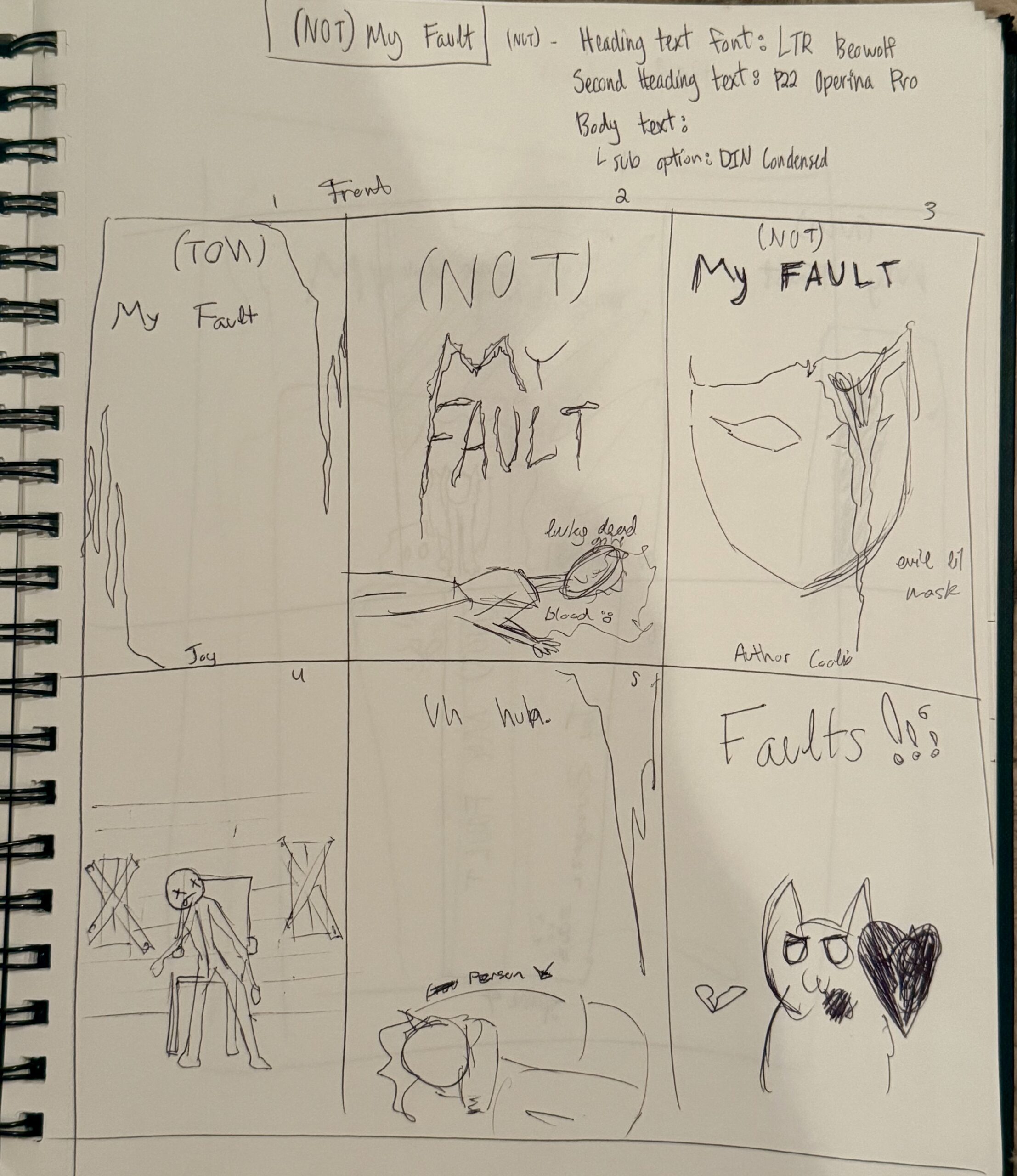
I go from sketches...
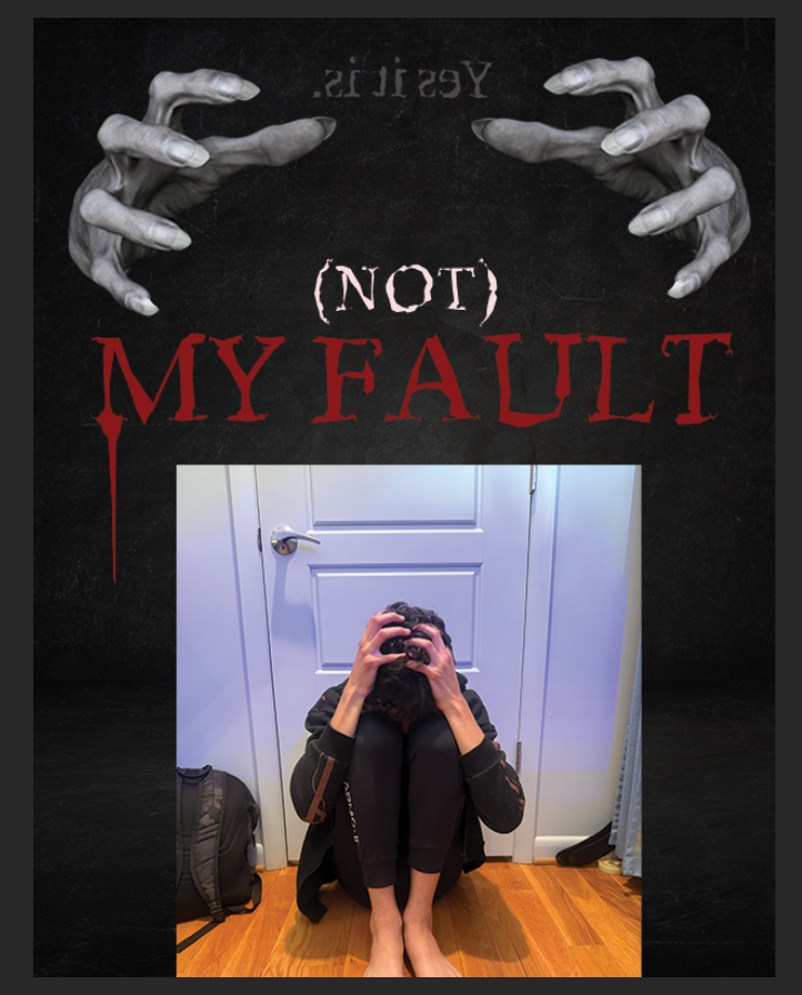
To first placing images and text...
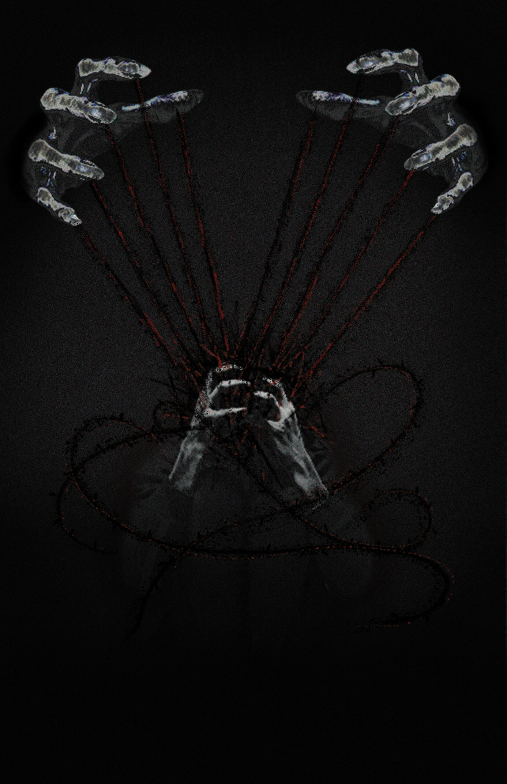
To editing the images...
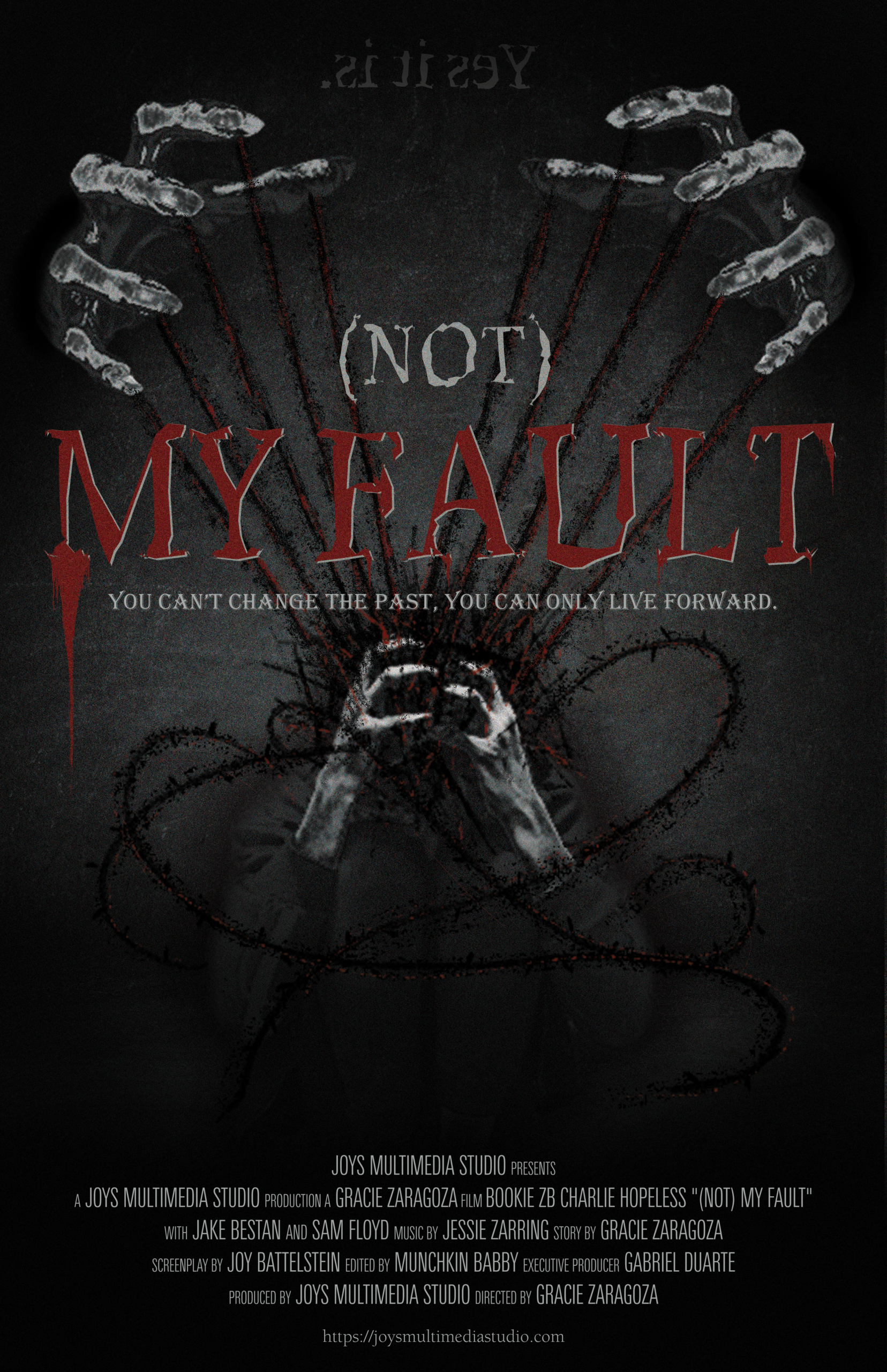
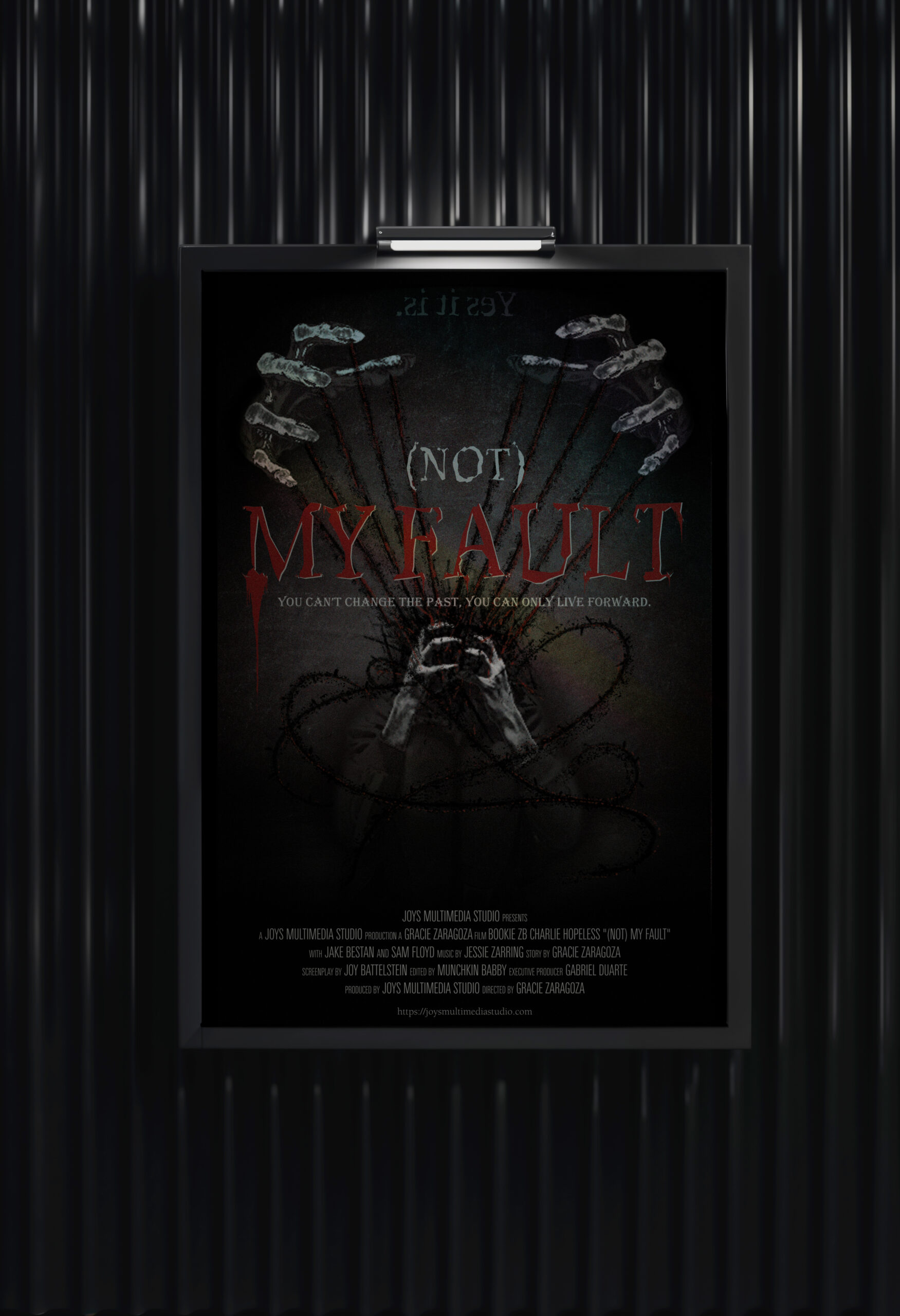
To adding text and final edits and mocking it up
Making a movie poster is honestly one of my favorite parts of design because it feels like you’re trying to tell a whole story in just one image. It’s not just about making something look good — it’s about capturing the mood of the film and giving people a first impression of what the story feels like.
When I start designing, I usually think more about the behind the scenes and emotions first instead of jumping straight into effects or layout. I ask myself what kind of feeling I want someone to get when they see it. That helps guide everything else like color choices, lighting, and composition.
For this project, I worked mostly in Photoshop and experimented a lot with layering, lighting, and typography. One of the hardest parts was figuring out how to balance everything so the poster didn’t feel too crowded, especially with text. Movie posters have a lot of required information, so making it all fit without ruining the design takes some adjusting.
Color grading was also a big part of it. I tend to go for darker tones with stronger highlights because it helps create a more cinematic feel. For this project though, the result was a lot different than what I originally thought of. I ended up going for the really dramatic white and black tones that I unintentionally discovered when messing with the curves edits. I’ve been really inspired by thriller and drama posters lately, especially ones that use simple but bold visuals instead of too much detail.
Typography was another thing I spent a lot of time on. I didn’t just want the title and credits to be slapped on top of the image — I wanted them to feel like they actually belong in the design. So I kept adjusting spacing, sizing, and placement until everything felt more natural.
Overall, working on this poster helped me understand more about how design choices affect storytelling. Even small things like contrast or font style can completely change the mood of a piece.
I definitely want to keep experimenting with more poster styles and push my designs further as I keep learning more about visual storytelling and film design.
Blog Post 2: Behind the Scenes of My Website Design Process
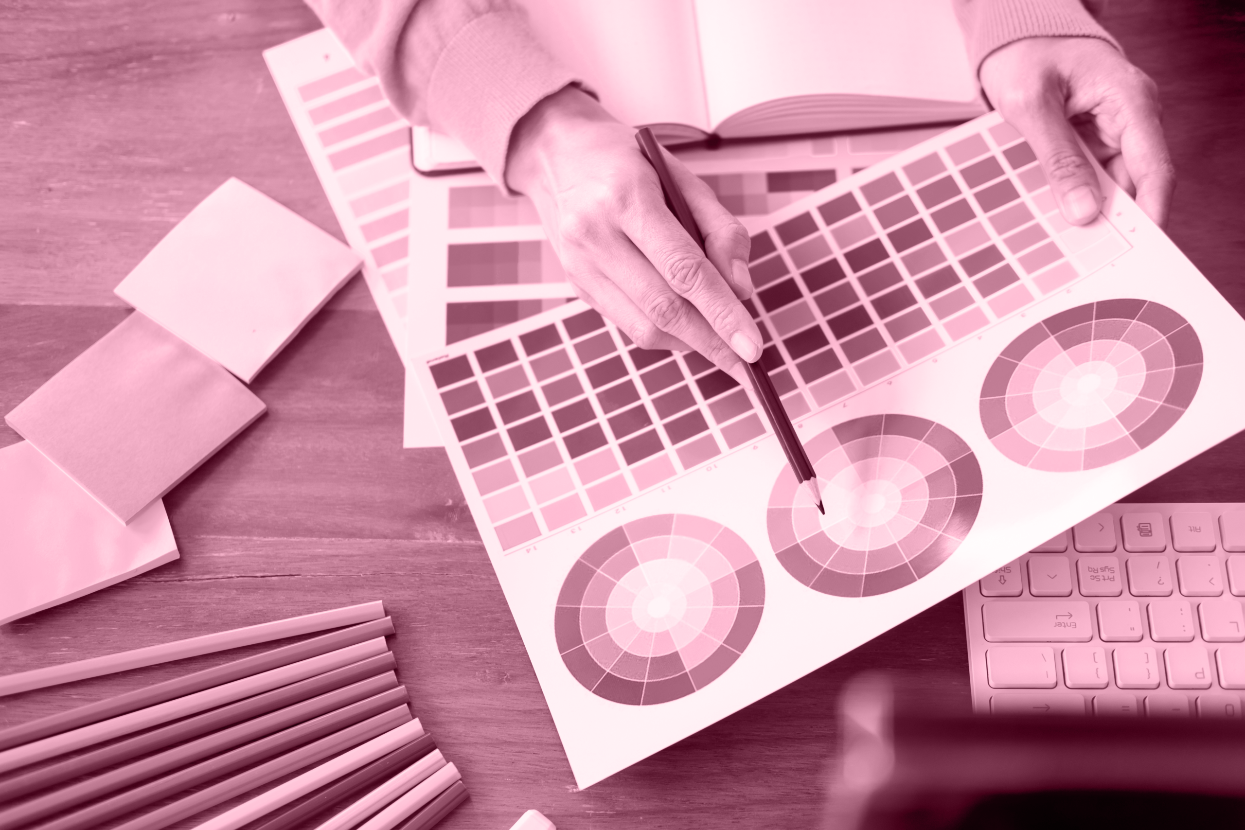
A lot of the process turned into problem-solving. Some sections didn’t line up the way I originally designed them, and images would sometimes crop differently depending on the screen size. That made consistency kind of tricky, especially when trying to keep everything looking balanced across pages.
One of the biggest learning moments was figuring out how much design is actually about flexibility. I couldn’t just force everything to match my wireframes perfectly, so I had to adjust my ideas while still keeping the overall vibe I wanted. I leaned into darker tones, purple accents, and more cinematic visuals to keep the branding consistent even when the layout shifted.
Navigation was another thing I worked through. I originally didn’t think too much about how users would move through the site, but once everything was built, I realized it needed to feel really clear and easy to explore. I went back and refined the menu so each section actually made sense as part of a whole studio site.
Overall, this process taught me that web design isn’t just about making something look good — it’s also about adapting to limitations and still keeping your creative vision intact.
Building my website, Joy’s Multimedia Studio, has been a mix of planning and a lot of adjusting as I go. I started with wireframes that were pretty clean and simple. I imagined everything having full control over spacing, layout, and structure, but once I actually started building in WordPress, I realized I had to work within the theme more than I expected.
Blog Post 3: How I Approach Visual Storytelling in Design
When I work on anything visual, I usually think more about storytelling than just making something look nice. Whether it’s a poster, a design piece, or a website layout, I always try to figure out what feeling I want someone to get from it first.
For me, visual storytelling is mostly about mood. Things like lighting, color, composition, and typography all work together to create a certain emotion. I tend to lean toward darker, more cinematic styles because I like creating contrast and depth in my work. Purple tones also show up a lot in my designs because they feel expressive and slightly dramatic.
When I’m working on a project, I usually start by collecting inspiration and thinking about the overall atmosphere before I focus on details. I try not to jump straight into effects or fonts right away, because I think that can make the design feel random instead of intentional.
A big part of my process is experimenting. I don’t usually land on the final version immediately — I test different layouts, adjust colors, move things around, and see what feels right. Sometimes the smallest changes end up making the biggest difference in how the design feels overall.
I also think storytelling is about clarity. Even if a design is artistic or abstract, it still needs to communicate something clearly to the viewer. If people can feel something from it without needing an explanation, I think that’s when it works best.